🏆 Awarded 3rd Place at Design at UCI’s Fall 2024 Project Teams Program 🏆
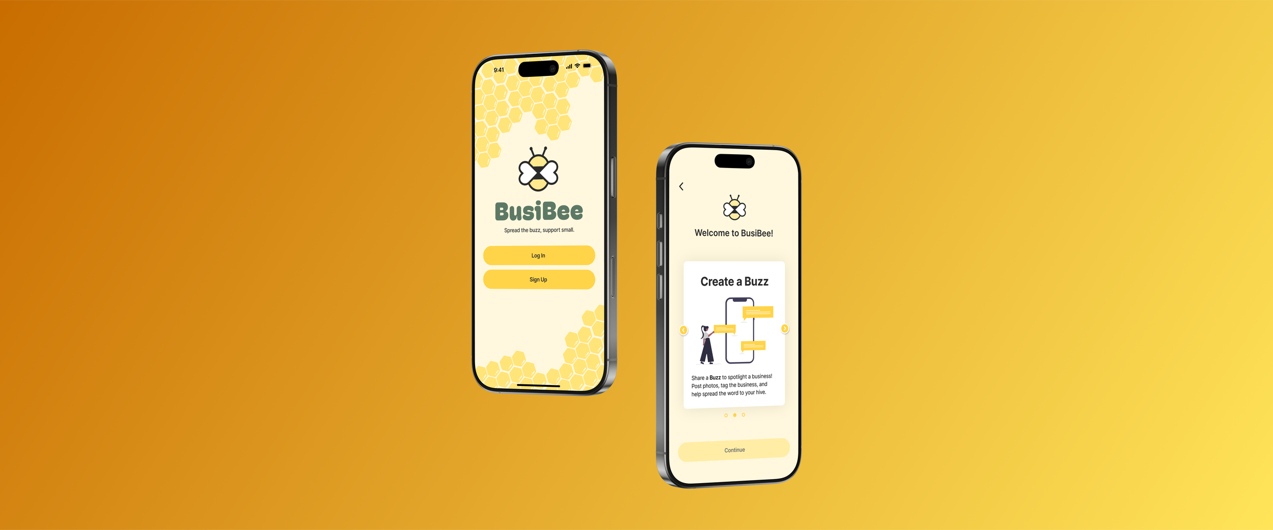
BusiBee is a mobile platform that enhances the shopping experience for both consumers and small businesses.
Role
Cooperated in a team of six to design a mobile solution for accessibility and information issues dividing consumers and small businesses
Conducted research such as competitive analysis, surveys, user interviews, usability testing, and user personas
Designed flows complete with prototyping and iterated on initial designs
Design Process
Problem Statement
The emerging generation of consumers struggle to support small businesses due to high cost and lack of accessibility, despite their desire to do so.
How can we develop a mobile application that implements seamless exploration and social features, to allow users to easily discover and uplift small businesses?
Research Findings - Key Insights
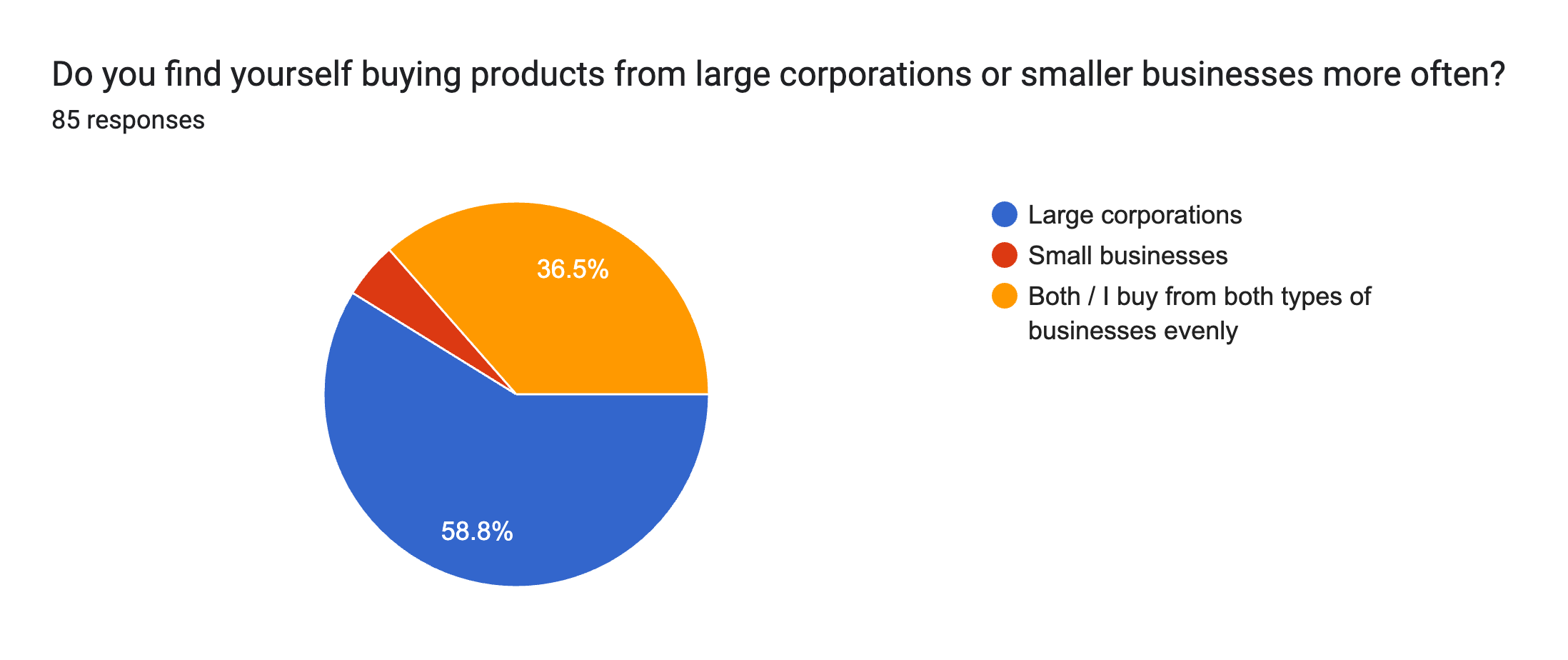
Our findings showed that people gravitate towards large corporations due to cost, convenience, and availability.
Small businesses struggle with accessibility and visibility, primarily relying on the algorithms of mainstream platforms like Instagram or TikTok to be seen, followed by word-of-mouth.
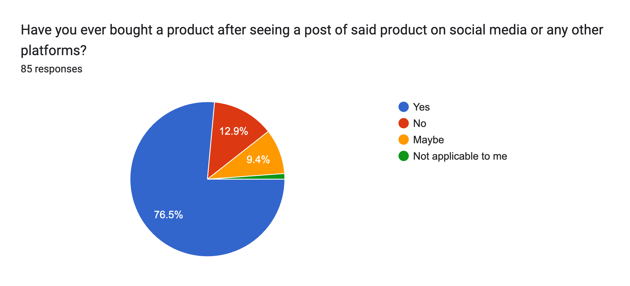
Surveys
85 responses
92.9% interested in supporting small businesses
76.5% purchased products advertised on social media
41.2% support small businesses over larger corporations
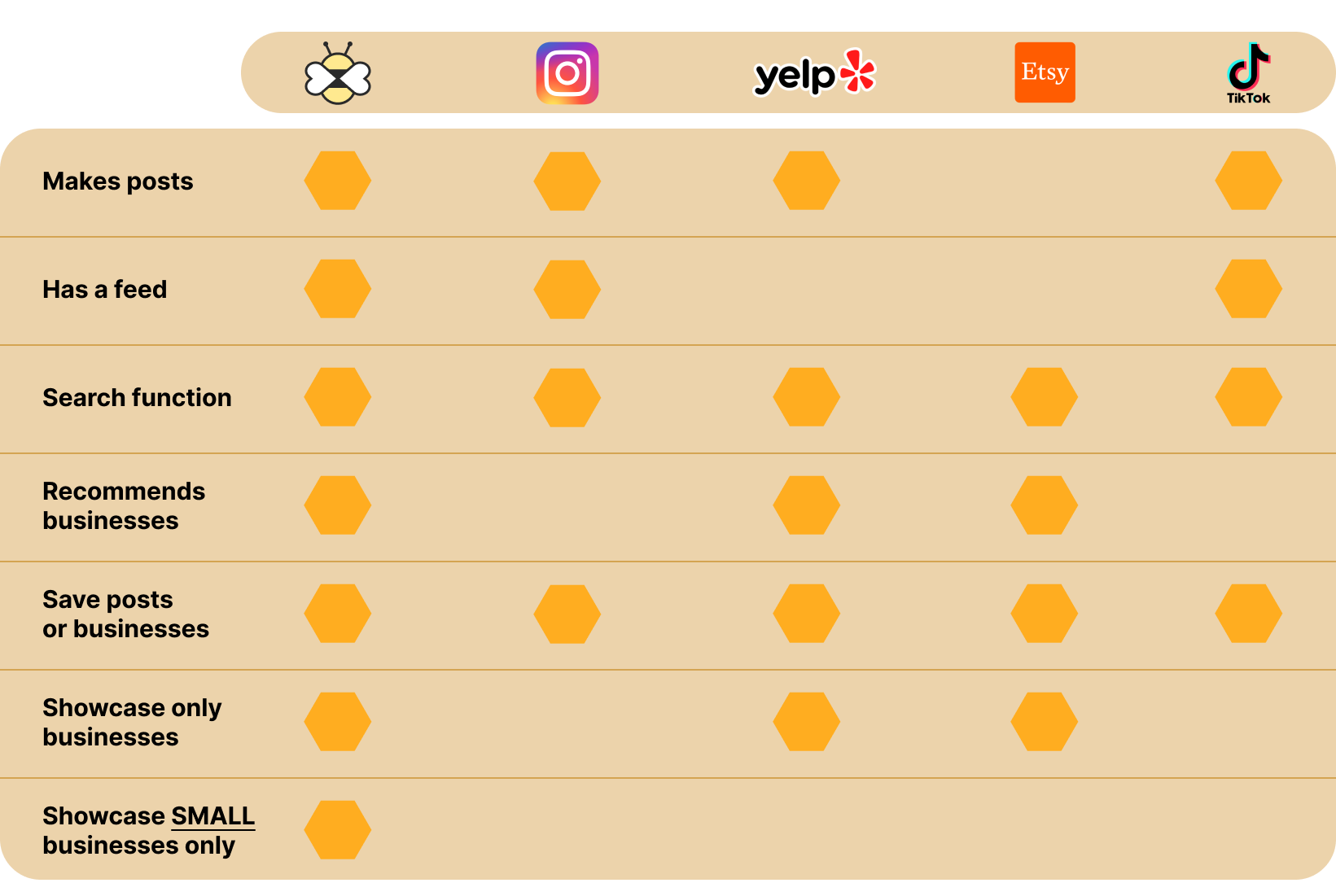
Competitive Analysis
Research Findings - User Persona
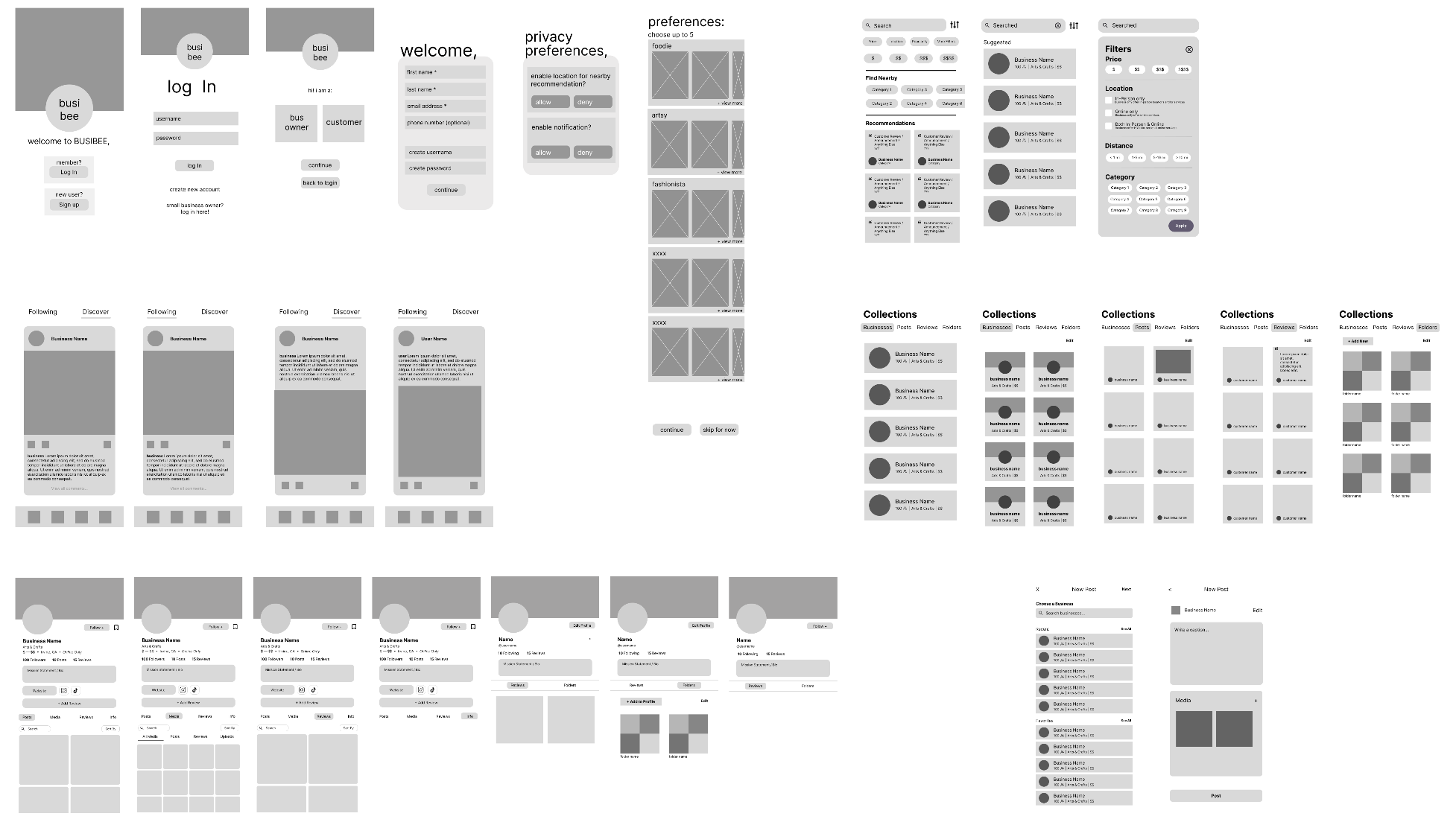
Design - Sketches, Userflow, & Low/Mid-Fidelity
With our compiled research in mind, I ideated simple sketches with my team, inspiring our low-fidelity frames. In addition to our sketches and low fidelity, we also mapped out a user flow based on our persona and research data.
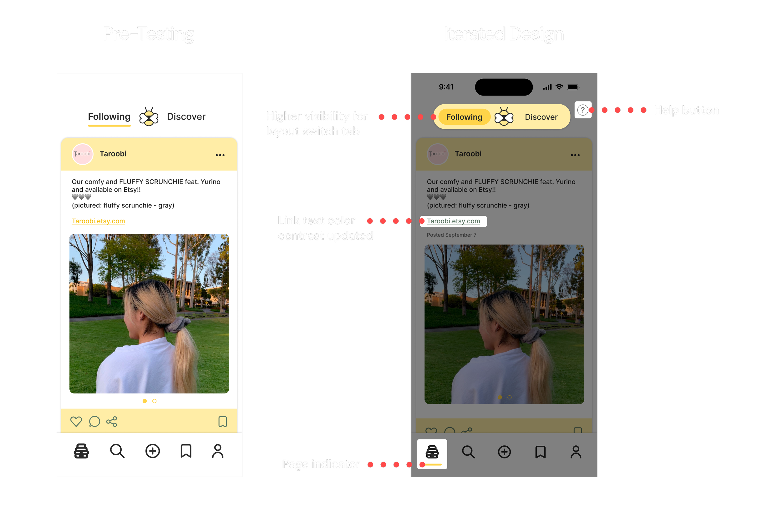
As I wanted to emphasize business visibility, I introduced the idea of having a dual layout for the app’s home page. Using an upper nav bar, users could switch between the ‘Following’ and ‘Discover’ sections, allowing them to view updates/products from businesses they follow and app-recommended businesses that may align with their interests with just one tap.
Sketches

Interviews
3 interviews
Loyalty is desired by small business owners
Visibility is key; small business owners rely on being seen
Branding helps recognizability and draws customers; promoting on social platforms is crucial
Competitive Analysis
5 apps analyzed
1/5 apps showcase ONLY small businesses
3/5 showcase businesses at all
3/5 recommend businesses to users


User Flow Diagram
Brand style guide
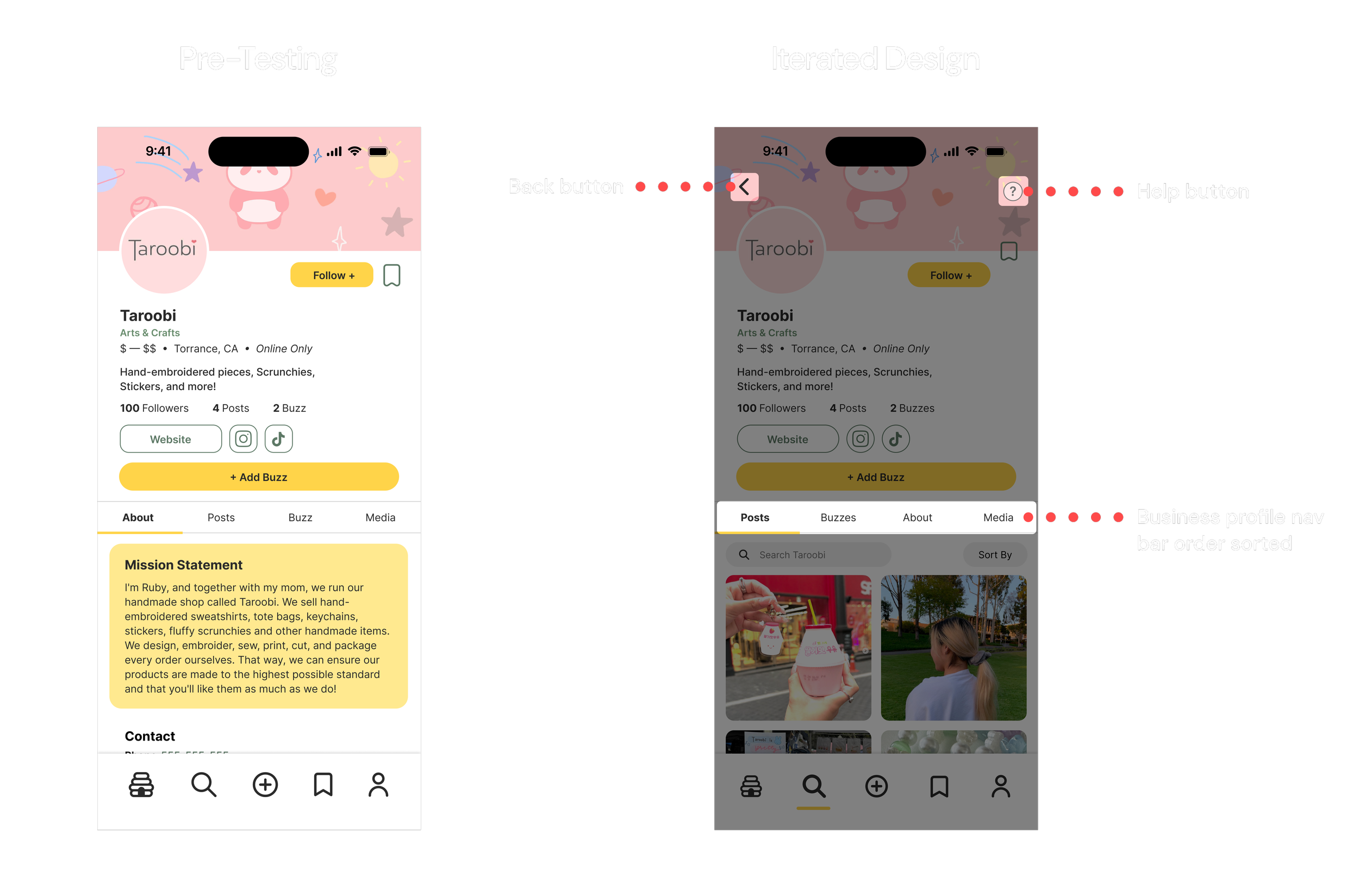
Usability Testing - Findings
To further iterate upon our design, we conducted usability tests of our initial high-fidelity prototype by allowing users to explore our app’s flow. Our tests yielded the following obstacles:
Issue 1: The difference between a Post made by a business and a Buzz made by a user was confusing.
Issue 2: The Collections and Folders feature was confusing.
Issue 3: Users could not visit the previous page on most flows.
We made the following changes to make navigation more intuitive and give clarity to our app’s functions:
Solution 1: A tutorial explaining core app features was implemented at the end of onboarding.
Solution 2: “Collections” was renamed to “Saved”.
Solution 3: Back buttons were added on every page.
Solution 4: An expandable help button was added on each page.
Solution 5: Buzzes were color-coded yellow in “Saved”.

Design - High-Fidelity V2
Following our usability test findings, I optimized my initial home page design to adhere to our solutions, improve visibility of certain artifacts, and refine the overall flow.
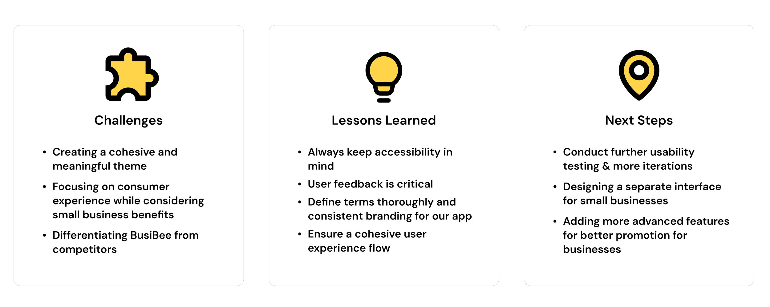
Reflection & Key Takeaways
Final Demo Video
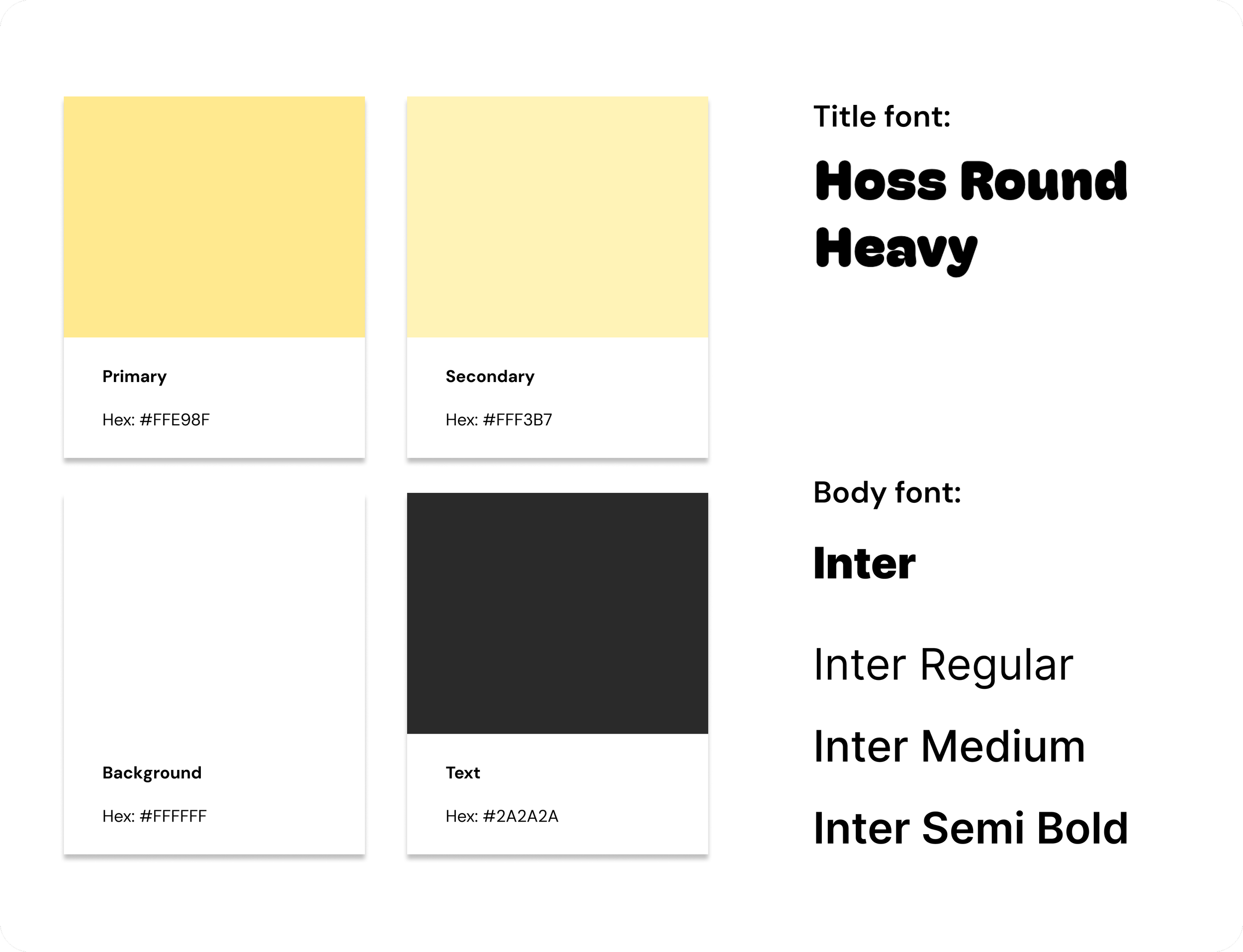
Design - Brand Style Guide
We chose shades of a brighter yellow for our primary and secondary colors to create an exciting yet welcoming atmosphere.
Hoss Round Heavy served as our title font to present a softer tone, and Inter was our main body font for ease of readability.
Home Page V1 Prototype
Design - High-Fidelity V1
For the high-fidelity home page frames, I preserved my initial idea of the dual layout and aimed for a post format familiar to users. Each post would have its own like, comment, and save button (which would add posts to the ‘Collections’ page).

User Survey Data


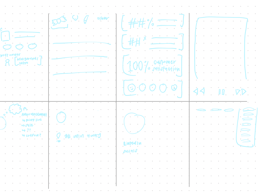


Sketches & Low/Mid-Fidelity
Lo/Mid-fi Frames


Finally, to further empathize with our users and consolidate our findings, we also structured a user persona based on the motivations and pain points most prominent in our research. By establishing a user persona, we were able to better ideate the features needed for our app and how to structure our flow.

Solution
Our solution is BusiBee, a mobile platform for small businesses to find and build a supportive community of users. On the app, small businesses will have the opportunity to grow and expand their business, post updates, and highlight their mission and goals all in one place to make themselves easier for consumers to find.